Sunday 13 April 2014

Evaluation

For our evaluation of our finished products, my group members split the roles of answering questions.

Question 1: In what ways does your media product use, develop or challenge forms and conventions of real media products?

I answered this question, by uploading screenshots of our music video, and uploading them via www.dipity.com. With each screesnshot I added a brief description, and explained how it conformed to typical pop conventions. As well as still images of our video, I also included links of videos of other pop artists. I did this to make links of similarities between our music video, and other pop videos. Overall i found that our pop video, mainly successfuly conformed to typical conventions of the pop genre. I have also included the link:

http://www.dipity.com/Ishpreet/In-what-ways-does-or-media-product-use-develop-or-challenge-forms-and-conventions-of-real-media-products/


In what ways does your media product use, develop or challenge forms and conventions of real media products? on Dipity.

Although our music video has conformed to conventions of pop; there are areas which we could improve to appear more conventional. For example it would have been more typical for our dancers, to perform a set routine. They instead took to mainly carrying out different moves from one another. We subverted the typical convention of the lead having a prominent love interest throughout the video. Instead we subtly indicate that Kala (lead) was involved with a love interest; as in the bedroom scene she wakes up in a oversized shirt which could belong to a male, whith whom she.


Question 2: How effective is the combination of your main product and ancillary texts?

Rumena Ahmed answered this question, by using a prezi presentation:


Question 3: What have you learned from your audience feedback?

For this part of the evaluation, Chloe Connell and I decided to create a news report. Before answering our question, Chloe typed our answer into www.cueprompter.com, so that i could read out the question with ease. Below is a screenshot of the cue prompter, taken by Chloe:


We then edited the question, and Chloe Connell then uploaded it via YouTube:


Question 4: How did you use media technologies in the construction of the research, planning and evaluation stages?

Chloe answered this question, by using www.timetoast.com. She acknowledged  the different types of media technologies, that we used within our research, planning and evaluation.

Thursday 10 April 2014

Final video, digipak and digipak magazine advertisement

This post is dedicated to our final products. Below is the video for our finalised music video for 'Crazy Kids'. Chloe Connell and myself directed the video. Chloe Connell, Rumena Ahmed and I all filmed for different parts of the video, however Chloe Connell took the lead role of filming. Once having uploaded all of our footage onto Final Cut Pro, Chloe Connell and I edited the video together. Chloe Connell then uploaded the video via Youtube.


Rumena Ahmed took to creating the digipak and digipak magazine advertisement. She embedded them onto imgur as seen below:


Typical conventions have been followed for the digipak, which are typical of both our artist and digipaks for pop artists in general. For example the typography used for Kesha's name here, is associated with Kesha. This is as the 's' in her name, is presented as a dollar sign: '$'. This represents Kesha's star image motif, as she uses the dollar sign within her name. Bright colours have been used and enhanced through PhotoShop, this is a typical convention as it captures the attention of the audience. It also connotes a theme of fun. The use of balloons and images of our lead (Kala) as well as others also connotes a theme of partying and fun, which can be associated with Kesha. This is as Kesha is known as being a 'wild child'. A tracklist, label and the logo of Kesha's distributing group have also been included, which is typically seen on digipaks. The promotional single 'Crazy Kids' in included on the red cup, which is placed near Kala's lips. The name placement is typical, as it enables the audience to know that the digipak is a CD for that particular sinlge. Red cups are used in popular culture, as it holds connotations of 'partying', this links to the theme of 'Crazy Kids'. 

Rumena Ahmed then used typical conventions of digipak promotional adverts, to create the magazine design. The magazine advert includes the typical convention of having an image of the artist (Kala). The dominant colour of the advert is dark pink. Dark pink can hold connotations of being 'passionate' and being 'energetic'. This can link to Kesha's sexualised image, which she presents in her music videos. The typography is similar to the one used in our digipak, but it is a lighter colour so it is noticeable against the pink. Once again the use of the dollar sign ('$'), is associated with Kesha's star image motif. The advert holds typical conventions such as the distribution logo of the artist, as well as the name of the hit single 'Crazy Kids'.

Finalised digipak magazine advert:

Using the original magazine advert design made by Rumena Ahmed, Chloe Connell and I decided to develop it further, by creating a similar advert with changed features. We decided to use this advert for the digipak as our finalised design, as it holds more conventional features.


In this finalised advert we changed the image of our lead. This image is more conventional, as Kala (lead) looks directly at the camera. This shows 'Kesha' to be confident, which is a trait Kesha is known for having. She seems to have a happy expression as well as wearing a dress, which links back to the theme of partying in the song 'Crazy Kids'. Similarly we have also used the same colour pink, as well as the typography for the name 'Kesha' for the same reasons as mentioned above. However we changed the colour of typography for 'Kesha' to white; as it stands out amongst the darkened pink background. We have changed the typography and font colour for 'Crazy Kids'. We made the 'C' larger than the rest of the letters, to make it grab the attention of the audience, as well as seem playful. The colour of it is the same blue, as the blue used on the 'Crazy Kids' on the red cup which is seen on the digipak cover.

The drop shadow of 'Crazy Kids' is black, which makes it stand out as well as resembling features of graffiti. This links to a them of 'partying', 'fun' and 'recklessness', which can all be associated with Kesha's star motif.

We have conventionally used an image of the digipak for the advert, which enables the audience to know exactly what the digipak will look like. We also incorporated the idea of the website found on the advert, as well as the iTunes label and 'RCA' logo from the original advert design created by Rumena.

Friday 4 April 2014

Digipak and promotional advert design sketches


Rumena Ahmed created rough sketches, for the designs of the digipak and promotional advert.

 This enabled her to get an idea of what she wanted her final piece to look like. It also gave her an opportunity to think of what conventional aspects, to include into the design. She then uploaded the sketches of the design onto SlideShare.

Whilst creating the digipak, Rumena Ahmed created a video, which displays the steps she took to creating. This is helpful as it shows the decisions and choices she made, and at what time in the process she made them. By downloading quicktime, Rumena was able to display her editing process. She then uploaded the video via YouTube. Below is the video:

Wednesday 2 April 2014

Digipak promotional advert research

Digipak promotional adverts are important, as they advertise upcoming albums or songs of artists. I researched into two promotional adverts, and compared conventional features. This will be helpful in creating our own, as we draw inspiration from it. Below I have analysed the promotional advertisement for popular pop artist Britney Spears's album 'Circus'


Here are the main things that we as an audience are presented with:

  • The name of the artists ('Britney Spears'), in large capitalised font. It is shown in through a bright and vibrant colour, which indicates that they are the main focus of the advertisement.
  • The release date and name of the album
  • A hit single which the audience may be familiar with
  • A large proportion of the page is dedicated to an image of the artist
  • The image is quite sexualised: Britney appears to be showing a lot of skin, as well as directly looking into the camera which connotes her confidence
  • The font and theme of the advertisement is similar to the digipak
  • The theme of album name 'Circus' is expressed through the colour choice, and layout of the font
My team member Chloe Connell then went on to analyse Rihanna's promotional advert for 'Loud':

  • The digipack consists of vibrant colours in order to attract attention
  • The album title is called 'Loud', this is juxtaposed by the use of visual images as she appears to have her fingers over her lips signifying to 'shh'
  • An image of her album cover so that the audience know which album she is referring to and advertising
  • The use of typography to connote 'OUT NOW' so that the audience know when they can access the digipack
  • Close up of her face is used similarly on the album cover connoting her in a sexual desire reinforcing Laura Mulvey's male gaze
  • Similar use of vibrant colour of red is dennoted through he magazine advertisement and album cover

Tuesday 1 April 2014

Digipak research

Digipaks are usually limited edition, and are a type of packaging which accompany CD's. They can have a minimum of six panels, and may include features such as images of the artist/s, track listing, lyrics and so on. Depending on the genre of the of the artist/s, digipaks are presented in a certain way which are typical of certain conventions. As a lead up to creating our own digipak, in class we looked at various digipaks, and the way in which they were represented.

Chloe Connell took to researching the digipak, for album 'Teenage Dream' by pop artist Katy Perry:


My first Digipak I have chosen to research is the Katy Perry 'teenage dream' album, it follows the typical conventions of a Digipak such as having six panels in order to connote pictures of the artist using different shots such as a close up and extreme long shot. The use of bright pink colours help relate to Katy Perry's personality and is one of her artist conventions to use a lot of girly colours which also helps appeal to her target audience of being majorly females. The digipack also consists of a track list which usually appears on most digipacks to inform the distributers and audience what is featured on the CD so they know what they are buying. The CD also features Katy laying on clouds which represents one of her well known songs 'Teenage Dream' which most of her audience would be aware of. The digipack also denotes a parental advisory label as her audience may be quite young it informs those that the CD has no use of profanities and is suitable for a younger audience. Katy also appears to be laying in a sexual way, this shows that it would fit Laura Mulvey's male gaze which would also suit her male target audience.

I then went on to researching the conventions of 2pac's digipak, which is an album of his best hits:

I then went on to researching the conventions of 2pac's digipak, which is an album of his best hits. The first conventional feature on the cover, is the image of what appears to be the top half of 2pac from the back. From this image we can see that he is topless, but is wearing things such as a gold chain and watch. This links in with the hip-hop genre, as this connotes success and masculinity.
The font used to present 2pac's name, appears to look rough and battered. This may make 2pac seem raw and tough; which also links in with many other artists in the hip-hop genre. In terms of editing, the image of 2pac on the front cover, seems to have a sepia edit. This creates a dim light which emphasises his muscular body, which once again emphasises 2pac's macho persona. The front cover includes a 'parental advisory' label; this enables the audience to know that what they are about to buy may include explicit content.

By researching digipaks of different artists, I was able to see what particular conventions were used to meet a certain genre. The Katy Perry digipak differs greatly from the 2pac digipak. By looking into the 'Teenage Dream' digipak, it will help when creating our own as they both cater for a pop genre. For an example the 'Teenage Dream' digipak used vivid imagery through the use of bright colours. We may also opt to use bright colours for our digipak, in order to make it conventional of a pop genre.


Saturday 29 March 2014

Additional research- comparisons

For our music video, we attempted to have our lead (Kala) mimic Kesha's style.
 
Within various music videos of Kesha's, she can always be seen as having heavy eye make. This can differ from having glitter, or as the screen shot below shows, studs on her eyebrows. The screenshot is taken from 'We R Who We Are'. This adds to Kesha's image and star motif, as eye make up (glitter in particular), is something that is nearly always incorporated in her videos.


Whilst filming a particular scene, we decided to reflect this certain aspect of Kesha's onto our lead. We achieved this through using face crayons. Rumena Ahmed took to drawing different coloured swirls and patterns on and around Kala's eyelid. The screenshot below shows the patterns that Rumena drew. The use of bright colours can also be associated with Kesha, as well as link to the 'Crazy Kids' theme.


Friday 28 March 2014

Behind-the-scene images


Whilst filming for our music video, I took various pictures of Rumena and Chloe setting up behind the scenes. This included images of them setting up things such as the tripods, as well as lighting and filming. Rumena had control over the lighting, whilst Chloe Connell and I filmed. Chloe Connell then took an image of me setting up the camera. Chloe Connell then added the pictures onto Fotor Photo Collage, which shows exactly how we took to preparing for filming. Among the photos, i took a still image of our lead positioning herself for the camera. 

Each picture demonstrates different steps we had to take, in order to achieve a certain image. For an example the bottom right picture shows how we used props such as pink balloons and streamers. This is conventional in pop videos, such as the video for 'TGIF' by Katy Perry as it connotes a theme of fun. In this case it links to theme of 'crazy kids' and 'partying', which have been dominant within our video, and are similar to the star motif of Kesha who is seen as a 'wild child'. 
Below is a print screen from Kesha's music video for 'C'Mon', which also uses streamers:


The bottom middle picture shows Rumena adjusting the hair of the lead, and this shows how paying attention to small detail is essential. 

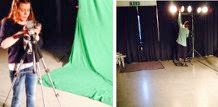
I also took behind the scene images for when we used the green screen, which I added together through the use of InstacCollage. Below shows Chloe and Rumena setting up: